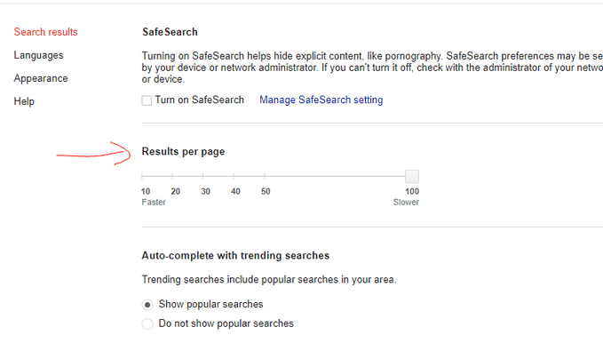
Guess what? Google is shaking things up by giving a new-look to their search settings! They’ve introduced a fresh interface reminiscent of their material design concept.
Instead of the plain and text-heavy appearance, the search settings have rounded and shaded borders, giving them a more visually appealing look.
Here Is The Screenshot That Has Been Shared On Twitter.
Earlier, The Search Setting Looked Like This:

So, did you notice the difference?
Get ready for a revamped experience when you dive into those search settings!
For more such updates, keep visiting this space.


